Ben gets a bigger head
The Series 1996 $100 note introduced a larger, off-center portrait and a collection of improved security features. Benjamin Franklin had not changed size; his responsibilities had expanded to include visibility under hurried retail conditions.

The first major redesign in generations
U.S. note designs had remained broadly stable since the small-size format of 1929. Advances in scanning, printing and copying eventually demanded more visible deterrents. The 1996 $100 began a denomination-by-denomination redesign program.
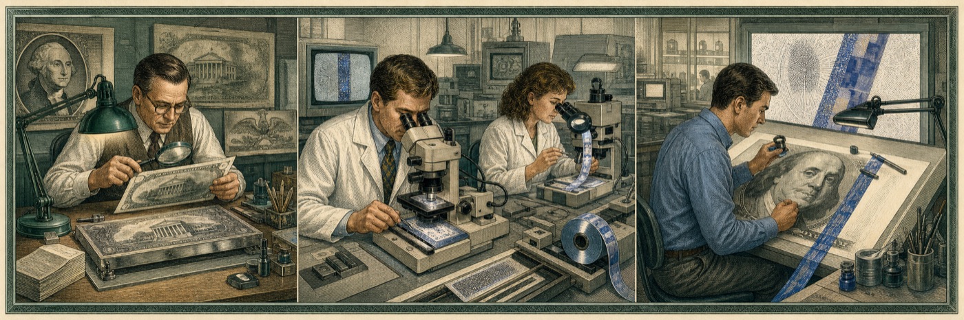
The enlarged portrait moved off center to create room for a watermark and reduce interference with wear at the fold. Fine-line patterns, color-shifting ink, microprinting and an embedded thread added multiple checks for the public and financial institutions.
Why keep the old note recognizable?
A radical redesign could confuse users and complicate international acceptance. The new series therefore preserved familiar portraits, colors and overall identity while changing scale, placement and security. Continuity was a feature, not a lack of ambition.
Older designs did not need to be exchanged. The United States does not demonetize previous Federal Reserve note designs merely because a new one appears. That policy reduces disruption but requires banks and businesses to recognize a very long visual family tree.
The institutional finding
The note had to look new enough to defeat counterfeiters and old enough not to frighten a cash register. The committee’s solution was to enlarge Benjamin Franklin until no one could reasonably claim not to have seen him.
Sources & further reading
These references support the factual claims. The institutional conclusions remain the sole responsibility of our highly decorative committee.
- 01U.S. Currency Education Program — History
Official redesign timeline.
- 02U.S. Currency Education Program — Older designs
Policy on older-design Federal Reserve notes.